Hemp House: The World’s Premium CBD Brands In One Destination
Discover how Brillmark helped Hemp House to scale their Shopify Store & provide exceptional user experience through their store with our innovative design & ideas!
The Requirement:
The Hemp House, our client, came to us with an immediate requirement to revamp their flourishing ecommerce store.
They sought our expertise to assist them in the redesign and development process, including implementing a user-friendly product showcase and a more efficient customer browsing experience.
Additionally, they desired to incorporate CRO-enabled elements to enhance their conversion rates.
We knew this project would require a platform that could adapt and grow with the company, and Shopify is the answer.
With Shopify’s flexibility and scalability, Hemp House can continue to expand and evolve while keeping its online store ahead of the competition.
The Challenge:
The task was transferring an existing store on the WIX platform to Shopify.
The main objective was to ensure that the website’s user experience and functionality remained intact while adding new features to improve customer satisfaction.
Several factors must be considered during migration, including preserving the user’s database and the category treemap.
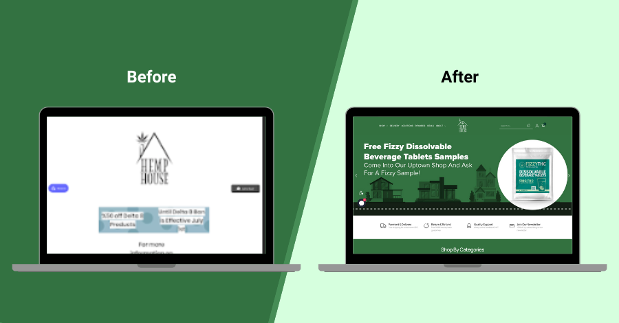
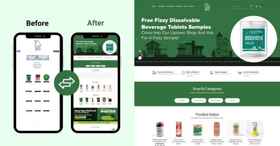
In addition, it was necessary to create a clean and modern UI/UX design that would enhance the overall customer experience.
Since the website was already operational, the design and development team had to ensure that the new version would maintain its revenue and increase it.
User testing was also conducted to ensure that the new website met the needs and preferences of the target audience.
The Solution:

Although we knew it would present a significant challenge, we were fully prepared.
The client had distinct requirements and expectations for the result, which we comprehended.
Bearing that in mind, we delved into the research phase, meticulously exploring the most fitting theme and approach to ensure the project’s success.
After completing the research, we began working on the project.
Our commitment was to produce a website that had a contemporary appearance and was user-friendly, and we succeeded.
The website was designed with a sleek new logo and an efficient payment gateway to streamline transactions.
The launch of this new website elevated the client’s business to the next level.
The Process:
#1 Planning
Team BrillMark, discussed with the client and developed a strategy so that the existing revenue is not lost, but more revenue is added.
We found the best-suited Shopify theme customization and included our UX designer in the best CRO-enabled elements related to UX, along with an excellent design for the store.
The client was updated with the working status of the project so that the work would be done smoothly without any glitches.
#2 Design
With precision and attention to detail, our team crafted a visually stunning, high-fidelity mock-up of key pages including the Homepage, Category/collection, and Product page, impressing the client with our design prowess.
#3 Development
Once access to the WIX account was enabled, Shopify was linked with WIX so that all WIX-stored data was sent to Shopify without any glitches for flawless Shopify migration service.
After completing all development work and migrating products and other data, they selected payment gateways & the ownership was transferred to the client.
A migration of the customers From WIX to Shopify, and using a tool, transferred reward points that customers used to get when they bought their products.
After all testing and setting up everything, the site was made live, and the last meeting was conducted to get on to a few things after launch.
#4 QA
While the design team was hard at work, our Quality Assurance experts meticulously combed through the entire site, proactively identifying and eliminating potential glitches for a seamless user experience.
The Final Product:

At Brillmark, we take pride in our ability to seamlessly handle complex website design and development projects from start to finish.
We embarked on a comprehensive journey for this project, from the initial idea to the final product launch.
Brillmark team of experts not only migrated the site but also gave it a complete makeover, with a fresh new design and improved functionality.
We worked closely with the client to understand their brand and create a custom design that accurately reflected their vision and values.
Our developers also ensured that the site was optimized for speed, security, and search engine performance.
We left no stone unturned and ran rigorous tests to ensure the site looked and worked flawlessly on all devices, providing an unparalleled user experience.
Our attention to detail and commitment to quality ensured that the site was able to meet the client’s business objectives and exceed their expectations.
Overall, our approach to website design and development is focused on delivering exceptional results that drive business growth.
Trust Brillmark to seamlessly take your website to the next level and help your business reach its full potential.
Do you need expert help with your Shopify Store?
Don’t stick with your old platform.
Need help upgrading your designs, migrating a website, or with the Shopify Store?
Reach out to us for expert advice.


